Created by Zhanchao Yang
Source ↗
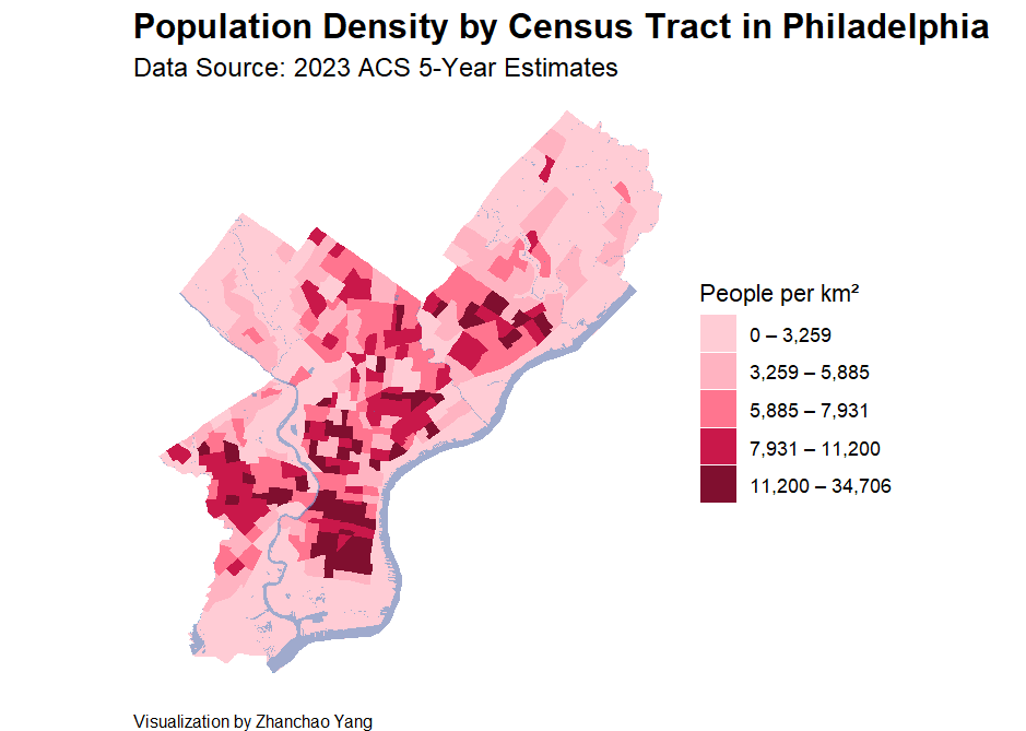
Day 3 (Polygons): I created a choropleth map visualizing population density across Philadelphia census tracts using R. This map employs polygon features to represent geographic areas, with a color gradient indicating population density per square kilometer. The visualization uses a five-category quantile classification system, ranging from light pink (lowest density) to deep red (highest density), making it easy to identify population concentration patterns throughout the city.
The map also incorporates water features from OpendataPhilly as a semi-transparent blue overlay, providing geographic context and highlighting Philadelphia’s relationship with its waterways.
Technical Implementation:
- tidycensus - R package for accessing U.S. Census Bureau data with built-in spatial features
- sf (Simple Features) - R package for handling spatial vector data and geometric operations
- ggplot2 - R’s powerful data visualization package, extended with
geom_sf()for mapping - tidyverse - Collection of R packages for data manipulation and transformation
- scales - R package for formatting numeric labels in the legends
Data Sources:
- Population Data: U.S. Census Bureau 2023 ACS 5-Year Estimates (Table B01003_001)
- Water Features: OpenDataPhilly - Philadelphia Water Features