Created by Jingqi Lu
Source ↗
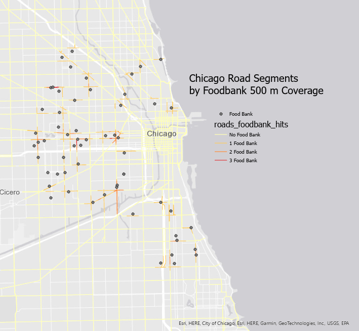
This map visualizes the accessibility of foodbanks across Chicago by showing how many foodbanks are located within 500 meters of each road segment.
Roads are color-coded by the number of nearby foodbanks — from none (gray) to high concentrations (deep red).
The visualization highlights accessibility disparities: central and southwest corridors have significantly denser foodbank coverage than peripheral neighborhoods.
Data were processed in Python using GeoPandas for spatial joins and visualized in ArcGIS Pro with a minimalist gray basemap to emphasize the accessibility gradient.