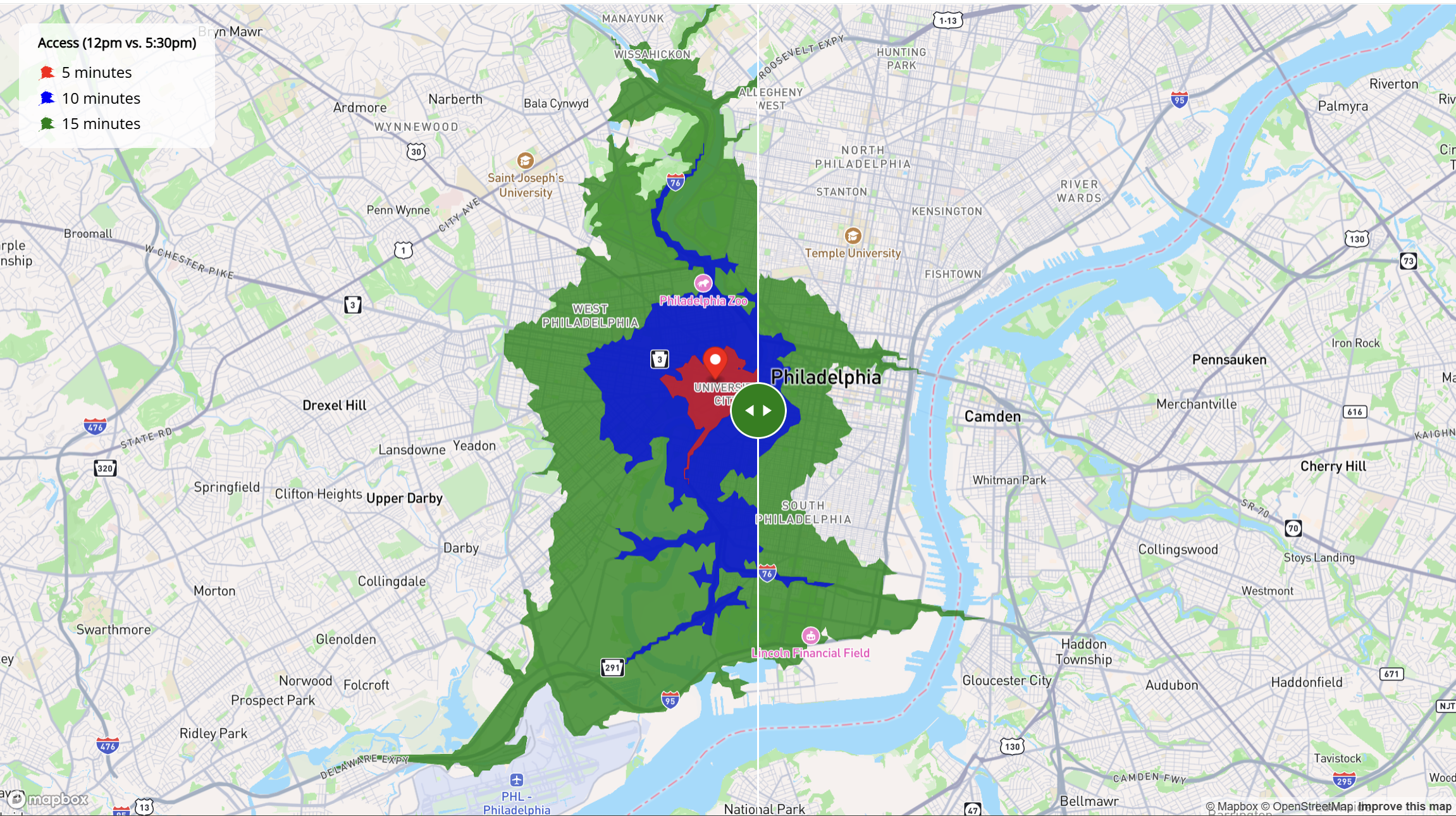
Day 7 (Accessibility): I built an interactive map that compares door-to-door travel times from the Weitzman School of Design (210 S 34th St, Philadelphia, PA 19104) at two moments in the day. Using isochrone analysis, it visualizes areas reachable by car within 5, 10, and 15 minutes at midday (12:00 PM) versus the evening peak (5:30 PM), revealing how congestion reshapes urban accessibility.
Powered by Mapbox GL JS, the map presents a side-by-side view of the two scenarios. Color-coded isochrones—red (5 minutes), blue (10 minutes), and green (15 minutes)—make it clear how the accessible footprint contracts during rush hour, underscoring why time-of-day effects matter for urban planning and accessibility analysis.
Explore the interactive map at my website hosted by GitHub
Acknowledgement:
Special thanks for the tutorial made possible by Dr. Kyle Walker.
Technical Implementation:
- mapboxapi - R package for accessing Mapbox APIs, including geocoding and isochrone services
- mapgl - R package for creating interactive Mapbox GL JS visualizations in R
- Mapbox Isochrone API - API service for calculating travel time polygons based on real-time traffic data
Data Sources:
- Travel Time Data: Mapbox Isochrone API - Real-time and predictive travel time calculations for September 11, 2025 at 12:00 PM and 5:30 PM
- Base Map: Mapbox vector tiles and street network data
Analysis Parameters:
- Location: Weitzman School of Design, University of Pennsylvania (210 S 34th St, Philadelphia, PA 19104)
- Time Periods: 12:00 PM (midday) vs. 5:30 PM (evening rush hour)
- Travel Times: 5, 10, and 15-minute isochrones
- Date: September 11, 2025