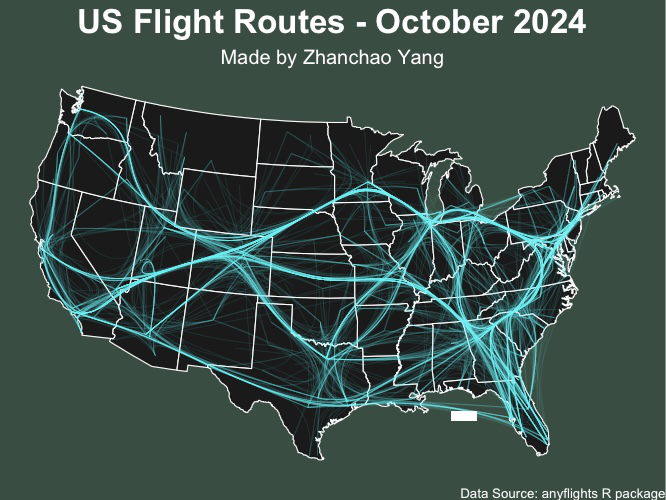
Day 10 (Air): I created a network visualization of US domestic flight routes for October 2024, showcasing the intricate web of air travel connections across the United States. This map uses network graph theory to visualize flight routes as edge-bundled paths connecting airports, creating an aesthetically striking representation of the nation’s aviation infrastructure. The cyan flight paths are rendered with transparency and bundling to reveal the density and patterns of air traffic flow.
The visualization employs the anyflights package to access real-time flight data and combines it with spatial network analysis using igraph and tidygraph. The edge bundling technique creates smooth, curved paths that reduce visual clutter while highlighting major air traffic corridors and hub airports.
Acknowledgement:
This visualization was made possible by the excellent tutorial created by Milos Makes Maps: https://www.youtube.com/watch?v=NBCwiwIjTGU.
Technical Implementation:
- tidyverse - R’s ecosystem of packages for data manipulation and visualization
- sf (Simple Features) - R package for handling spatial vector data and geometric operations
- anyflights - R package for accessing US domestic flight data
- igraph - R package for network analysis and graph theory operations
- tidygraph - R package providing a tidy interface to igraph for network manipulation
- ggraph - R package for creating network graph visualizations with ggplot2 syntax
- ggplot2 - R’s powerful data visualization package
- maps - R package for drawing geographical maps
Data Sources:
- Flight Data: anyflights R package - US domestic flight routes and airport information for October 2024
- Administrative Boundaries: US state boundaries from the maps package
- Airport Locations: Airport coordinates and FAA codes from the anyflights package
Coordinate Reference System:
ESRI:102003(USA Contiguous Albers Equal Area Conic) for accurate visualization of the continental United States