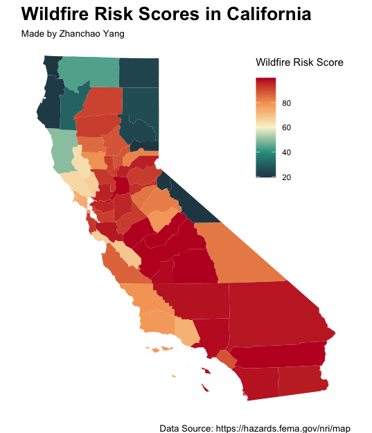
Day 15 (Fire): I created a visualization of wildfire risk across California counties, showcasing the spatial distribution of wildfire hazard levels throughout the state. This map uses a custom color palette transitioning from green (low risk) through warm yellows to intense reds (high risk), effectively showcasing the varying degrees of wildfire danger across California’s diverse landscapes. The visualization highlights the elevated risk in inland and mountainous regions compared to coastal areas.
The wildfire risk data comes from FEMA’s National Risk Index (NRI), which provides a comprehensive assessment of natural hazard risks at the county level across the United States. The Wildfire Risk Score (HWAV_RISKS) is a composite metric that combines expected annual loss from wildfire events with social vulnerability and community resilience factors. This index helps communities understand their relative wildfire risk and prioritize mitigation efforts. Higher scores indicate greater expected losses and community impact from potential wildfire events, considering both the physical hazard and the community’s ability to prepare for and recover from disasters.
Technical Implementation:
- sf - R package for handling spatial vector data and geometric operations
- tidyverse - R’s ecosystem of packages for data manipulation and visualization
- tigris - R package for downloading TIGER/Line shapefiles from the US Census Bureau
- ggplot2 - R’s powerful data visualization package (via tidyverse)
- grid - R package for low-level graphics and layout control
Data Sources:
- Wildfire Risk Data: FEMA National Risk Index (NRI) - County-level wildfire risk scores (HWAV_RISKS field)
- California Boundary: US Census Bureau TIGER/Line Shapefiles via the tigris package