Created by Zhanchao Yang
Source ↗
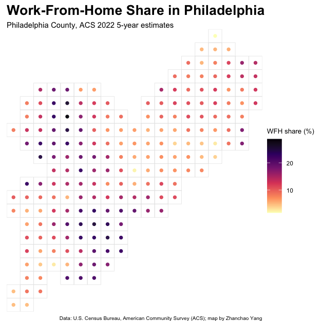
Day 16 (Cell): I created a cellular grid-based visualization of work-from-home patterns across Philadelphia, showcasing the spatial distribution of remote work adoption at the neighborhood level. This map employs a 1.5 km square grid system to aggregate census tract data into discrete cells, with colored points at each cell’s centroid representing the average work-from-home share.
Technical Implementation:
- tidycensus - R package for accessing US Census Bureau data including the American Community Survey
- sf - R package for handling spatial vector data and geometric operations
- dplyr - R package for data manipulation and transformation (via tidyverse)
- ggplot2 - R’s powerful data visualization package
- stringr - R package for string manipulation (via tidyverse)
Data Sources:
- Work-From-Home Data: U.S. Census Bureau American Community Survey (ACS) - 2022 5-year estimates at census tract level for Philadelphia County
- Geographic Boundaries: Census tract geometries from the tidycensus package (derived from TIGER/Line shapefiles)