Created by Zhanchao Yang
Source ↗
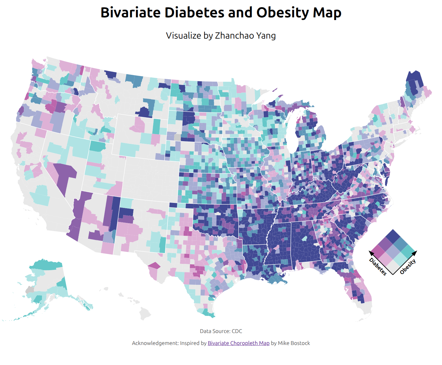
Day 17 (A New Tool): I explored D3.js for the first time to create a bivariate choropleth map visualizing the relationship between diabetes and obesity rates across U.S. counties. This map employs a 3×3 color grid to simultaneously represent two variables, where each county is colored based on its quantile position for both diabetes prevalence and obesity rates. The bivariate approach reveals spatial patterns in the co-occurrence of these health conditions, highlighting regions where both rates are elevated (darker purple tones) versus areas with lower prevalence (lighter tones).
Technical Implementation:
- D3.js - JavaScript library for creating dynamic, interactive data visualizations in web browsers using SVG, Canvas, and HTML
- TopoJSON - Extension of GeoJSON that encodes topology for more efficient geographic data representation
Data Sources:
- Health Data: CDC Diabetes and Obesity Data - County-level diabetes and obesity prevalence rates
- Geographic Boundaries: US Atlas TopoJSON - U.S. counties and states in Albers projection (975×610 viewBox)