Created by Zhanchao Yang
Source ↗
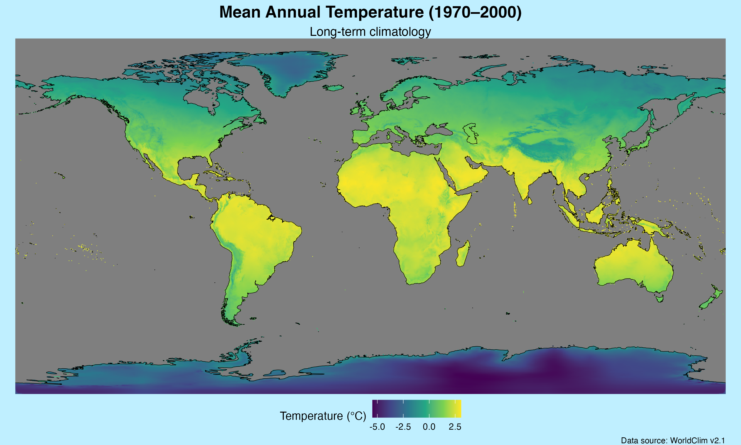
Day 22 (Natural Earth): I created a global visualization of mean annual temperature (1970–2000) using WorldClim climatology data and Natural Earth coastlines. This map employs a viridis color scale to represent temperature gradients across the planet, ranging from the coldest polar regions to the warmest equatorial zones. The visualization uses 10 arc-minute resolution climate data to show long-term temperature patterns, with Natural Earth medium-scale coastlines providing geographic context. The color scheme effectively highlights the dramatic temperature differences between latitudes, from frigid blues in polar regions to warm yellows in tropical areas.
Technical Implementation:
- terra - R package for spatial data analysis and raster operations, used for processing multi-layer climate data
- geodata - R package for downloading and accessing geographic datasets including WorldClim climate data
- tidyterra - R package providing tidy tools for working with terra SpatRaster objects in ggplot2
- ggplot2 - R’s powerful data visualization package for creating the map visualization
- rnaturalearth - R package for accessing Natural Earth vector map data at various scales
- sf - R package for handling spatial vector data and geometric operations
- viridis - R package providing perceptually-uniform color scales for data visualization
Data Sources:
- Climate Data: WorldClim v2.1 - Global climate data at 10 arc-minute resolution (~18 km at equator), providing monthly mean temperature values for the period 1970–2000
- Geographic Boundaries: Natural Earth - Medium-scale coastlines accessed via the rnaturalearth package for geographic reference